Dixie George- Specialist Practice
Veining Practice
2nd Attempt


3rd Attempt


4th Attempt

For the 4th testing of veining, i encorporated some prosthetics into the hands, to explore some designs that i have been toying with in my head. Here I will discuss some of the colouring of the veins, but i go into more detail about the prosthetics and veining testing on the next page. (1st Hand Testing).
5th Attempt


6th Attempt


7th Attempt


8th Attempt
After the first attempt, it occurred to me that veining was definitely something I needed to practice and experiment with. For this makeup I am not sure whether to have the veins subtle and realistic or more cyborg-like and obvious. I also wish to test with luminescent paint as a way to tie in the electro luminescence.
The first problem I had was the size of the spread when airbrushing, I realised that I needed to get more control and a thinner line. After some research I found out that to do this you need to have the air pressure down to the mimimum, for this compressor it is about 5/10 psi.
Colour
For the last test, I used skin illustrator for the veins, for this test I used Creatix airbrush luminescent airbrush colours. These colours are aqua colour and diluted with water, so to put them through he airbrush I mixed them at a ratio of 2:1 water to paint.
This test was somewhat more successful compared to the previous test. However, it still needs some practice. There are some areas where the airbrush hovers and causes areas that are more opaque than others. I also think that the shapes of the lines re not right, and it is too thick.
With testing the electroluminescent paint, because it is pink it is a little hard to tell what it would look in blue, but I don’t think that it would be very natural looking.
However i am not 100% sure that is what i am looking for now, I think that the pattern and the application are right for human like veins but the colour is all one colour and doesn't vary enough.

Fig. 27.1
Fig. 27.17
Fig. 27.36
Fig. 27.39
Fig. 27.40
Fig. 27.38
Fig. 27.37
Fig. 27.33
Fig. 27.34
Fig. 27.32
Fig. 27.35
Fig. 27.31
Fig. 27.26
Fig. 27.24
Fig. 27.29
Fig. 27.30
Fig. 27.27
Fig. 27.28
Fig. 27.12
Fig. 27.2
Fig. 27.20
Fig. 27.23
Fig. 27.22
Fig. 27.18
Fig. 27.10
Fig. 27.13
Fig. 27.21
Fig. 27.19
Fig. 27.16

Fig. 27.25
Fig. 27.3
Fig. 27.14
Fig. 27.15
Fig. 27.9
Fig. 27.11
Fig. 27.6
Fig. 27.7
Fig. 27.8
Fig. 27.4
Fig. 27.5
For the third test I tried to mimic the veins as much as I could, so I used the airbrush technique with the Vein Ton colour from the Kristyan Mallet skin illustrator palette. I believe the result is far better than what I tried before but the colour still isn’t what I am looking for. It looks more natural, but it is really dirty looking and I don't think it works for this makeup.
Below I tried the same materials as above, which were skin safe silicone airbrush paints, but I used a brush to apply them, what I found about this technique was better at controlling the colour, the way it fades in and out to look under the skin works. But I found with the shape of the vein, the paint bled really easily into my skin, so I don’t think I should use it in the final application.
In fig. ?? and Fig. ?? i tried to apply some luminenscence over the top of the vein to get a cybord roboting shine to it, similiar to the pen above but much more subtly. I still havent decided if I will use this technique yet. But i do think it looks metalis and could possible work.
For this makeup it seemed that the brush technique needed exploring so i bought myself a really tiny bristles brush to apply the makeup, to keep it really precise.
The makeup used in below is watercolour based paints. I thought because i am only doing a photo-shoot the makeup does not need to last really long, so even if after long periods of time the water colour is rubbed or sweated off, for a quick shoot it does not matter.
In stead of following human vein patterns so much, as I was not getting very far with the patters, I decided to concentrate on making them look more robotic under the skin. Similar to the photo in Fig. 27.17. However what i think is wring with this design is that the lines are too short and close together, they need to be longer and flow a little.
I think with the testing below I am finally getting somewhere with the design. I like using the water colour because it means that i can adjust and fade down the intensity and the colour. and it also allows me to easily merge the different tones and hues from purple to green together.
The photos below in Fig. 27.18 and Fig. 27.19 show spider veins in the legs, but i think i have an idea from this to include both the colours. The blue under the skin that could be quite robotic in deisign and the thin maroon capilleries that could represent the the infection and the human veins in the makeup.
I have tried to copy the effect below and I really like it. I think that it looks exactly what I am looking for. For the blue veins i used aquacolor paints, and I like how i can make them look under the skin but making them look washed out. And the red veins are with greasepaints and from that palette was the colour I wanted. This technique is not hard to do, but I think the design needs to be specified.
Below are two examples of inspiration from films. The first being from the film Total Recall (2012) it is a CGI version of a phone within the hand. But i liked it because of the lighting up designs, it is similar to what i want to achieve with this makeup. But also I liked the patterns of the fingers and the palm.
The second example is really similar to my concept idea. This is from Iron Man 2 (2010) i really like the veins how they come out from the centre, they are quite human and cyborg like, However they really look fake, like they are not under the skin but painted on top. I think this could have been corrected by fading them out in some areas.
I am really happy with the tests above and below.
Although I really like the tests above, I feel you can see my veins under the skin, so I thought I would test with some foundations first to see if it would effect the paint and the application. Or whether it would make the skin look more robotic underneath. I have met with my model and know that his face is quite freckly, I don’t know whether to make him have a "Perfect" complexion buy giving him a base tone first.
After testing this method, i don't like the effect at all, and i think makes the makeup unrealistic so i will not do this on the application.
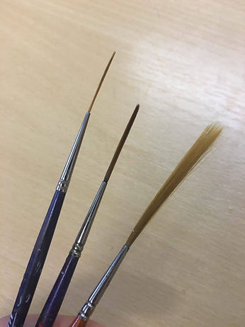
Before the final design I wanted to have one final test. For this I had watched Casey Love's sculpey painting techniques tutorial for Stan Winston and in it, he had use an airbrush really lightly to create a vein shade and then go over it with a long bristled brush like the ones below. I got my hands on some of these to practice with, as they supposedly create a really good natural vein line.
However I found them slightly difficult to use, and I think this was because I was trying to create a bit of a different more ridged vein line, rather than a wobbly line. I believe that for this test I was a lot more subtle with the application and precise especially with the maroon greasepaints. And I think I have nailed the effect that works for this makeup and idea.